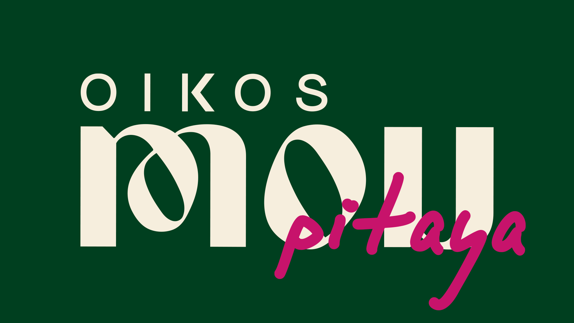
Mou
Cookware Line | Linha de Panelas
Brand Development & Launch Campaign | Desenvolvimento de marca e campanha de lançamento
[EN]
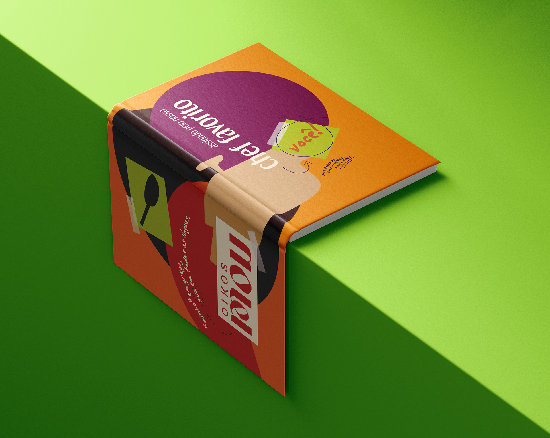
Combining quality and modern design at a more accessible price than the competition, the Mou cookware line, launched by Oikos, set out to become the household favorite, the kind of pan that stays with you in every moment.
Brand Development & Launch Campaign | Desenvolvimento de marca e campanha de lançamento
[EN]
Combining quality and modern design at a more accessible price than the competition, the Mou cookware line, launched by Oikos, set out to become the household favorite, the kind of pan that stays with you in every moment.
My Role
I was responsible for the visual strategy, and the creative and art direction across the visual identity, packaging, communication materials, photography, and video. I led a multidisciplinary internal team and oversaw an external production company, from concept to final delivery.
--
[PT]
Combinando qualidade e design moderno a um valor mais acessível que o da concorrência, a linha de panelas Mou, lançada pela Oikos, veio com a proposta de se tornar a queridinha da casa, aquela panela que acompanha você em todos os momentos.
meu papel
Responsável pela estratégia visual, direção de criação e arte da identidade visual, embalagens, materiais de comunicação, fotografia e vídeo. Liderei um time multidisciplinar interno e dirigi uma produtora externa, do conceito à entrega final.
In-house project while I was Head of Design and Photography at Grupo Ecoa | Projeto feito internamente enquanto eu era Headde Design e Fotografia no Grupo Ecoa.
[EN]
The Challenge
In a highly competitive market dominated by well-established brands, the brand development needed to be precise and bold enough to differentiate Mou and make it stand out, while still communicating clearly with the target audience and avoiding any sense of estrangemen
--
[PT]
O desafio
Em um mercado altamente competitivo, dominado por marcas já bem consolidadas, toda a construção da marca precisava ser certeira e ousada para que ela conseguisse se diferenciar e se destacar, mas, ao mesmo tempo, se comunicasse com o público-alvo e não causasse estranhamento.
[EN]
The Strategy
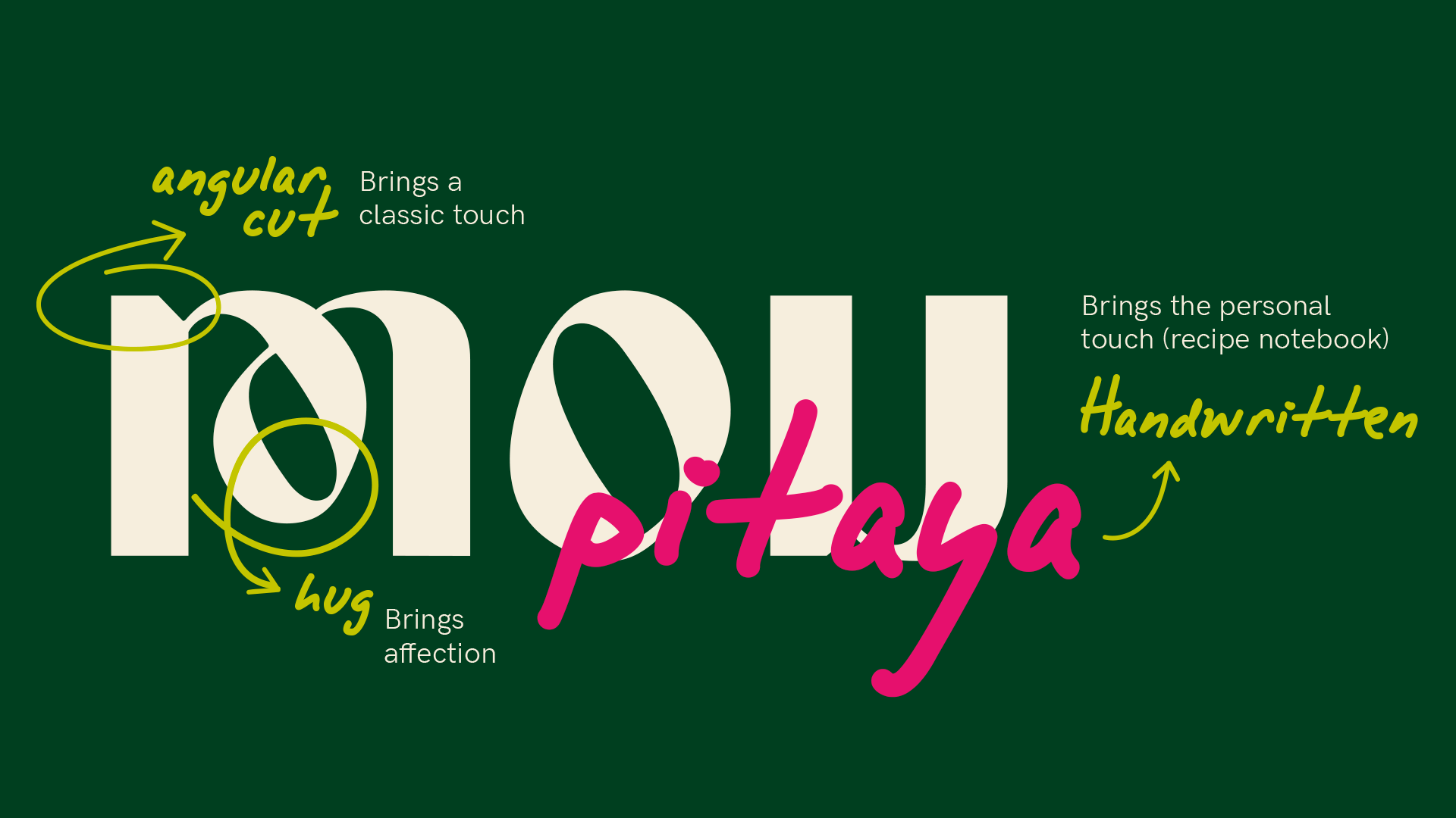
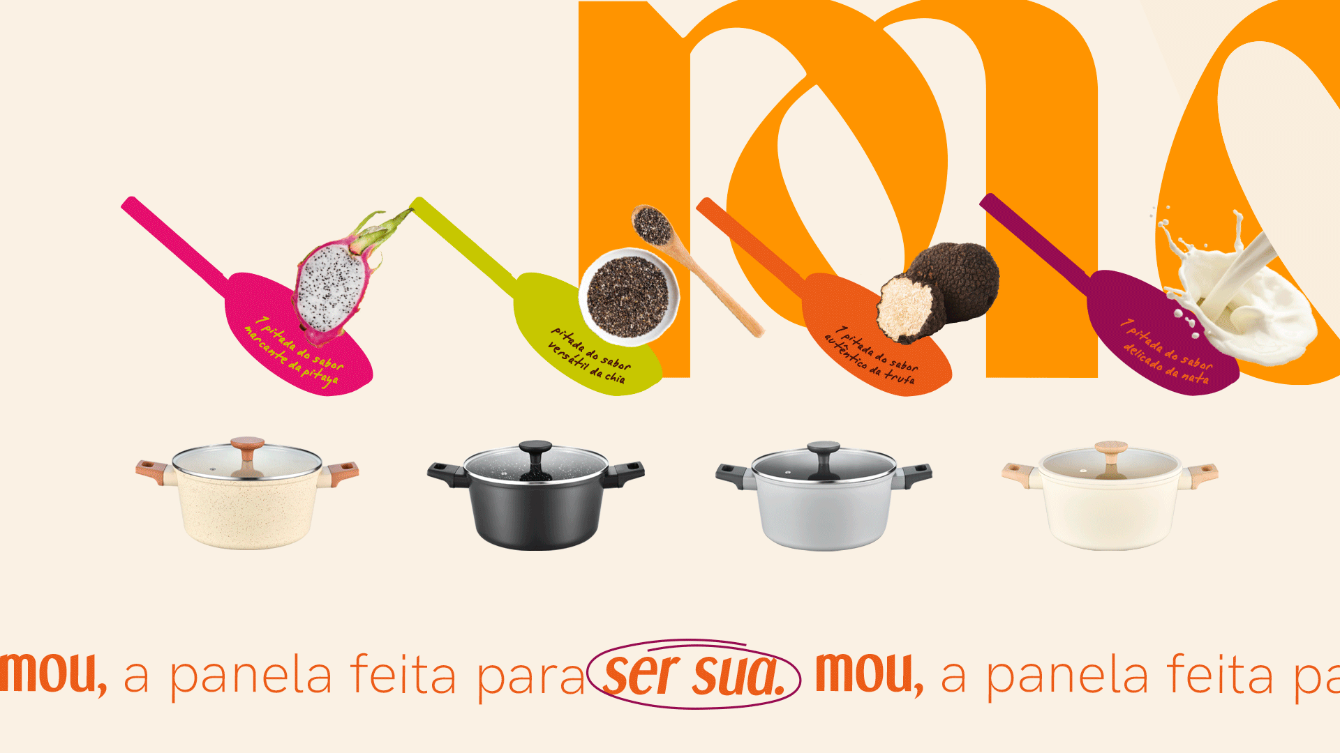
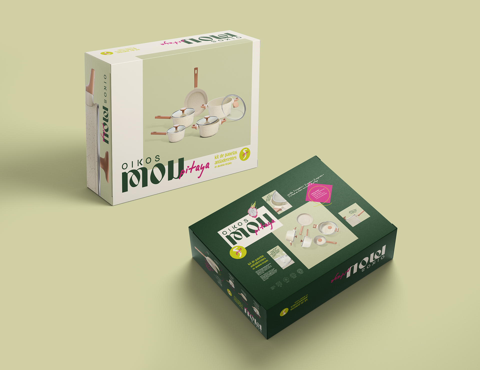
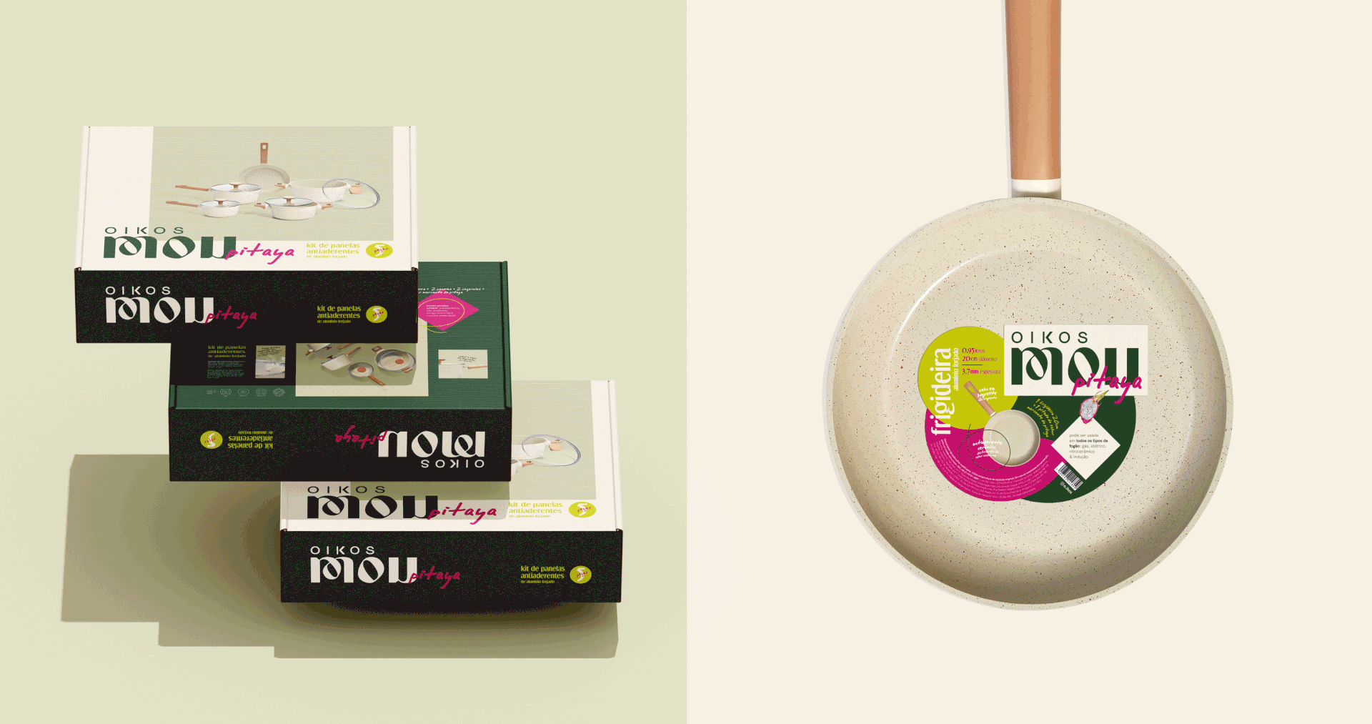
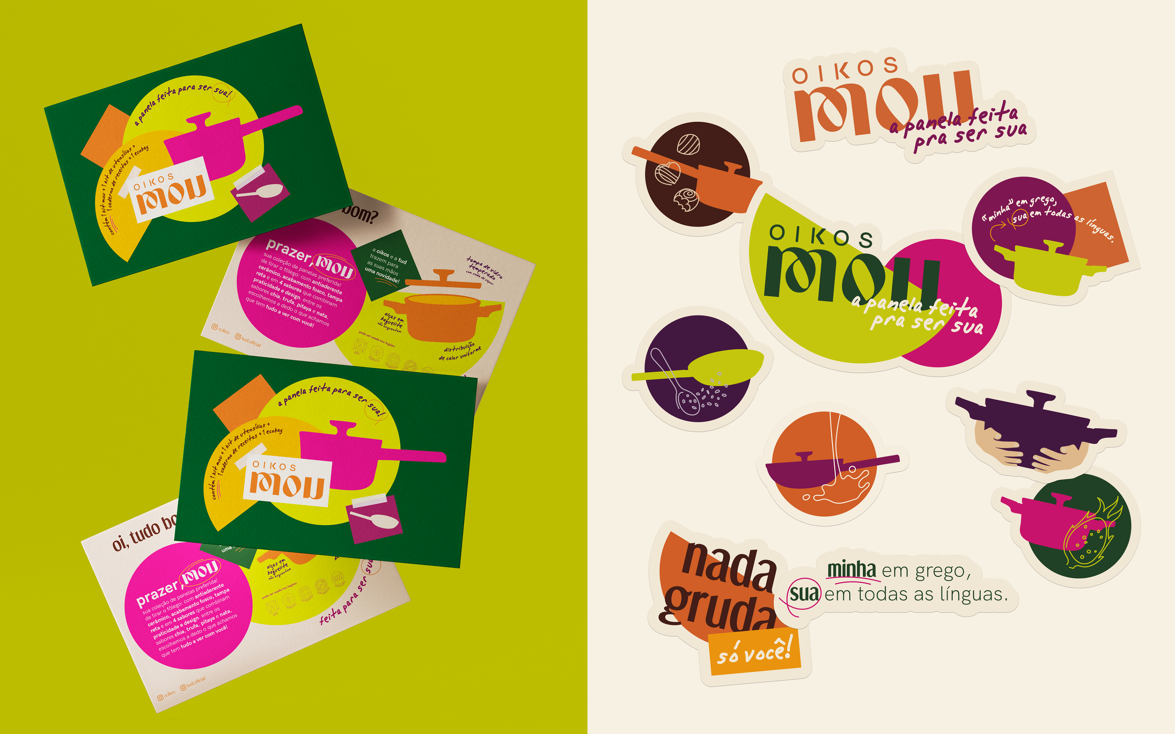
We leveraged the personality of the mother brand, Oikos. The pans, which came in four different color sets, had names inspired by “flavors,” represented through vibrant colors and a young, modern visual language across packaging and communication.
We leveraged the personality of the mother brand, Oikos. The pans, which came in four different color sets, had names inspired by “flavors,” represented through vibrant colors and a young, modern visual language across packaging and communication.
For the photography strategy, we adopted an artistic tone with intelligent humor. The launch video, dynamic and unconventional, set itself apart from what other brands typically do, while still connecting with the target audience. This new perspective brought freshness to an already saturated market, making the launch truly relevant.
--
[PT]
A estratégia
Aproveitamos a personalidade da própria marca-mãe, a Oikos. As panelas, que tinham quatro diferentes sets de cores, tiveram seus nomes inspirados em “sabores”, que representamos através de cores fortes e uma linguagem jovem e moderna nas embalagens e comunicação.
--
[PT]
A estratégia
Aproveitamos a personalidade da própria marca-mãe, a Oikos. As panelas, que tinham quatro diferentes sets de cores, tiveram seus nomes inspirados em “sabores”, que representamos através de cores fortes e uma linguagem jovem e moderna nas embalagens e comunicação.
Na estratégia fotográfica, adotamos um tom artístico, com humor inteligente. O vídeo de lançamento, dinâmico e pouco convencional, se distanciou completamente do que é tradicionalmente feito pelas outras marcas, mais ainda assim, se comunicava com o público alvo, trazendo uma abordagem realmente nova, tornando seu lançamento relevante em um mercado já saturado.
[EN]
Photographic Strategy
Photographic Strategy
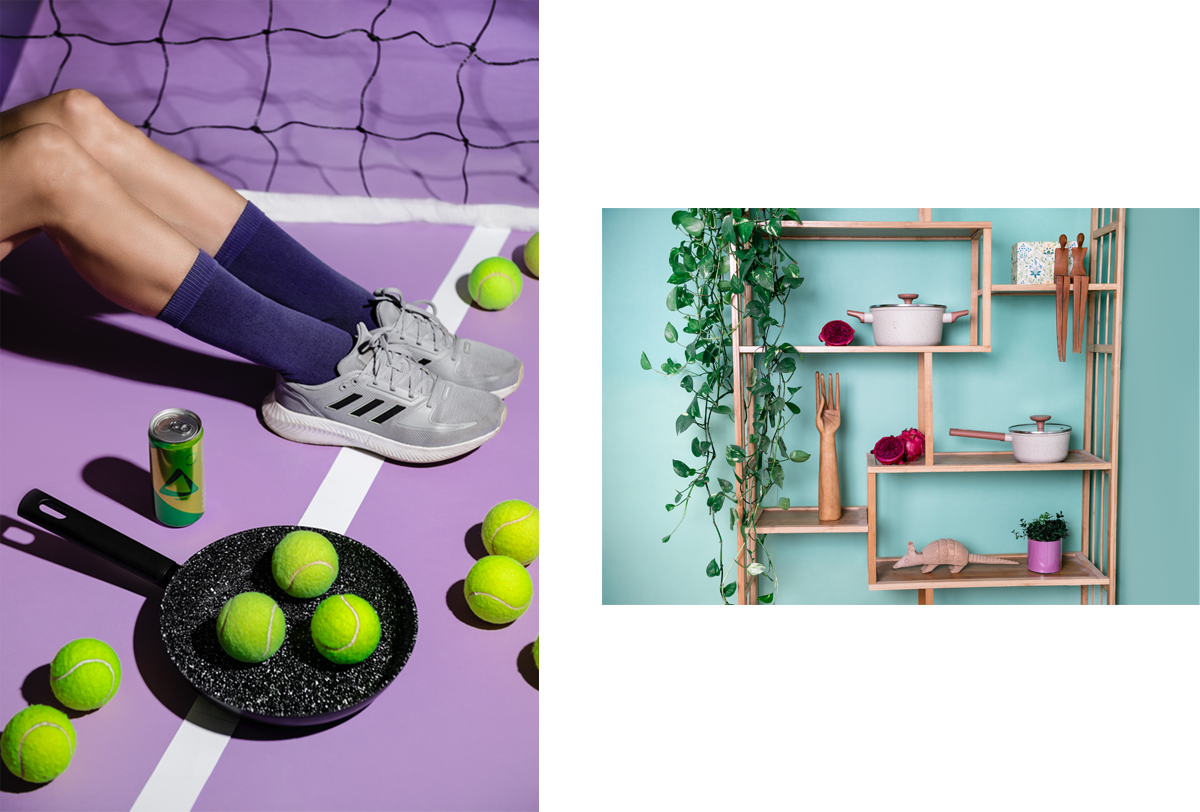
The photographic campaign explored three different approaches.
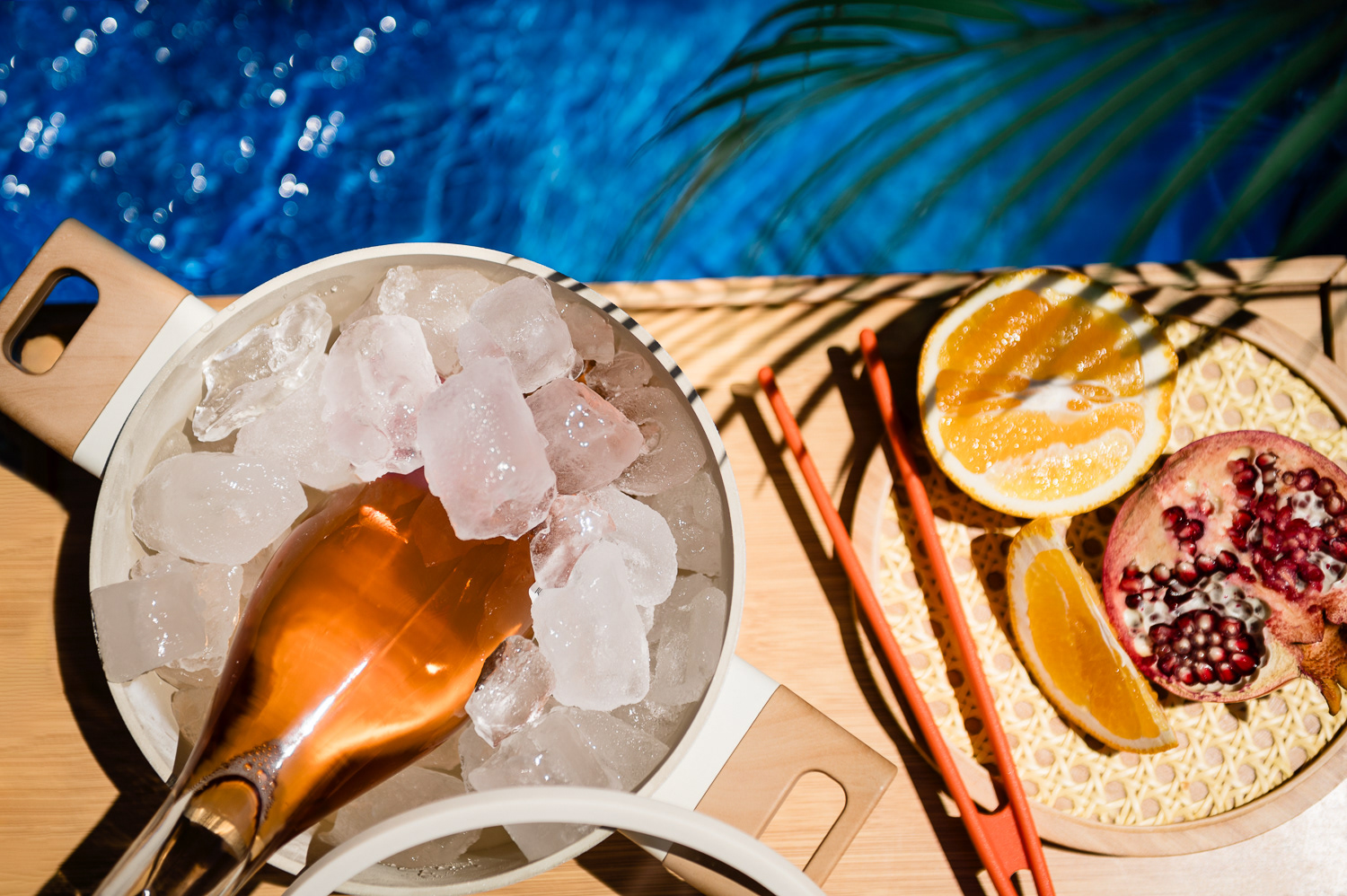
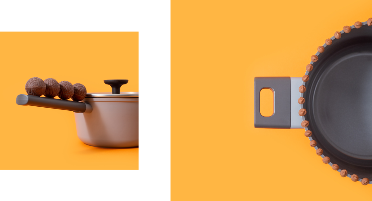
The first one reflected one of the brand’s key concepts: the pan set out to become the household favorite, the kind of pan that stays with you in every moment. Leveraging the mother brand’s intelligent humor, we imagined it in different moments of the day. Some were completely plausible, like serving as an ice bucket by the pool (still unconventional), while others were entirely unlikely, like becoming a tennis racket or a piece of shelf decor. All of this reflects Oikos’ characteristic clever humor.
--
[PT]
Estratégia de fotografia
A campanha fotográfica teve três abordagens diferentes.
--
[PT]
Estratégia de fotografia
A campanha fotográfica teve três abordagens diferentes.
A primeira refletia um dos conceitos centrais da marca: a panela queridinha da casa, aquela que acompanha você em todos os momentos. Aproveitamos o humor inteligente característico da marca-mãe, Oikos, e imaginamos as panelas em diferentes momentos do dia. Alguns totalmente plausíveis, como servir de balde de gelo à beira da piscina (ainda que não convencional), e outros completamente inimagináveis, como virar uma raquete de tênis ou um objeto decorativo em uma estante.

[EN]
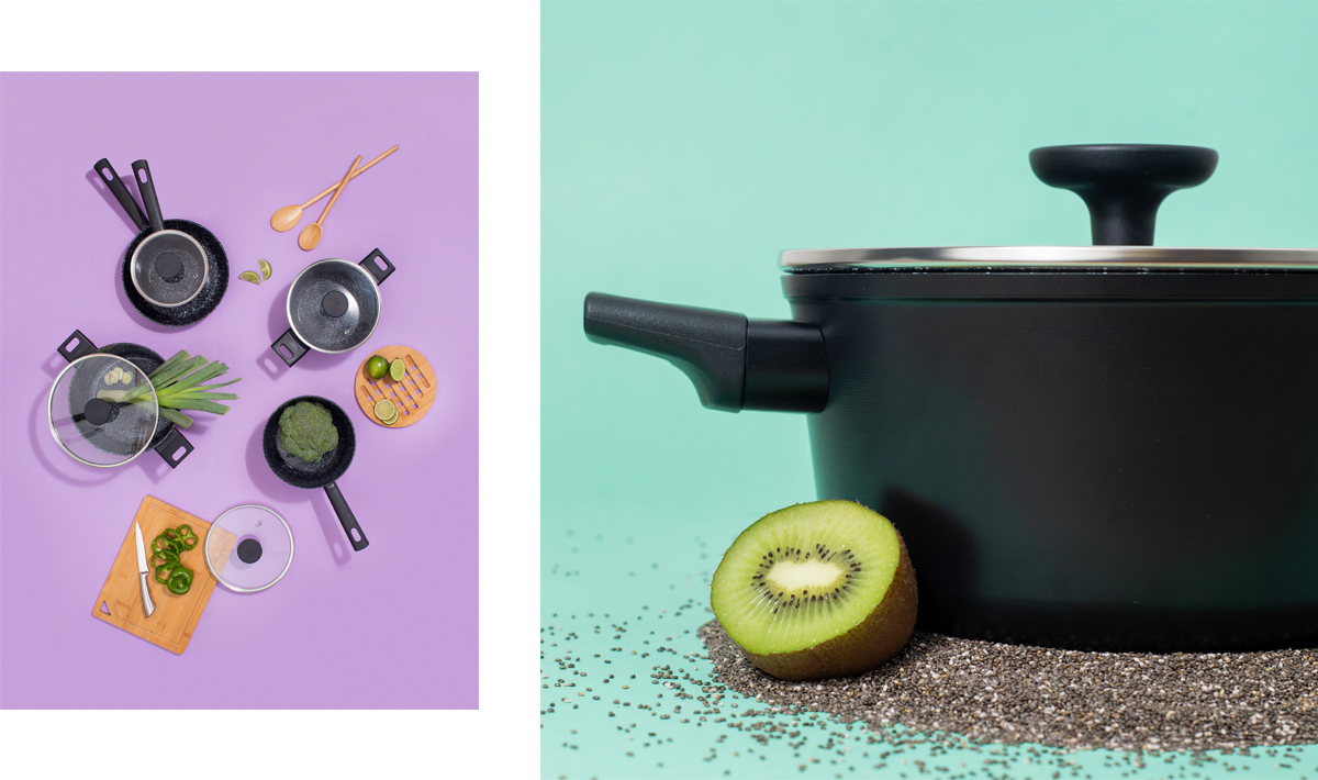
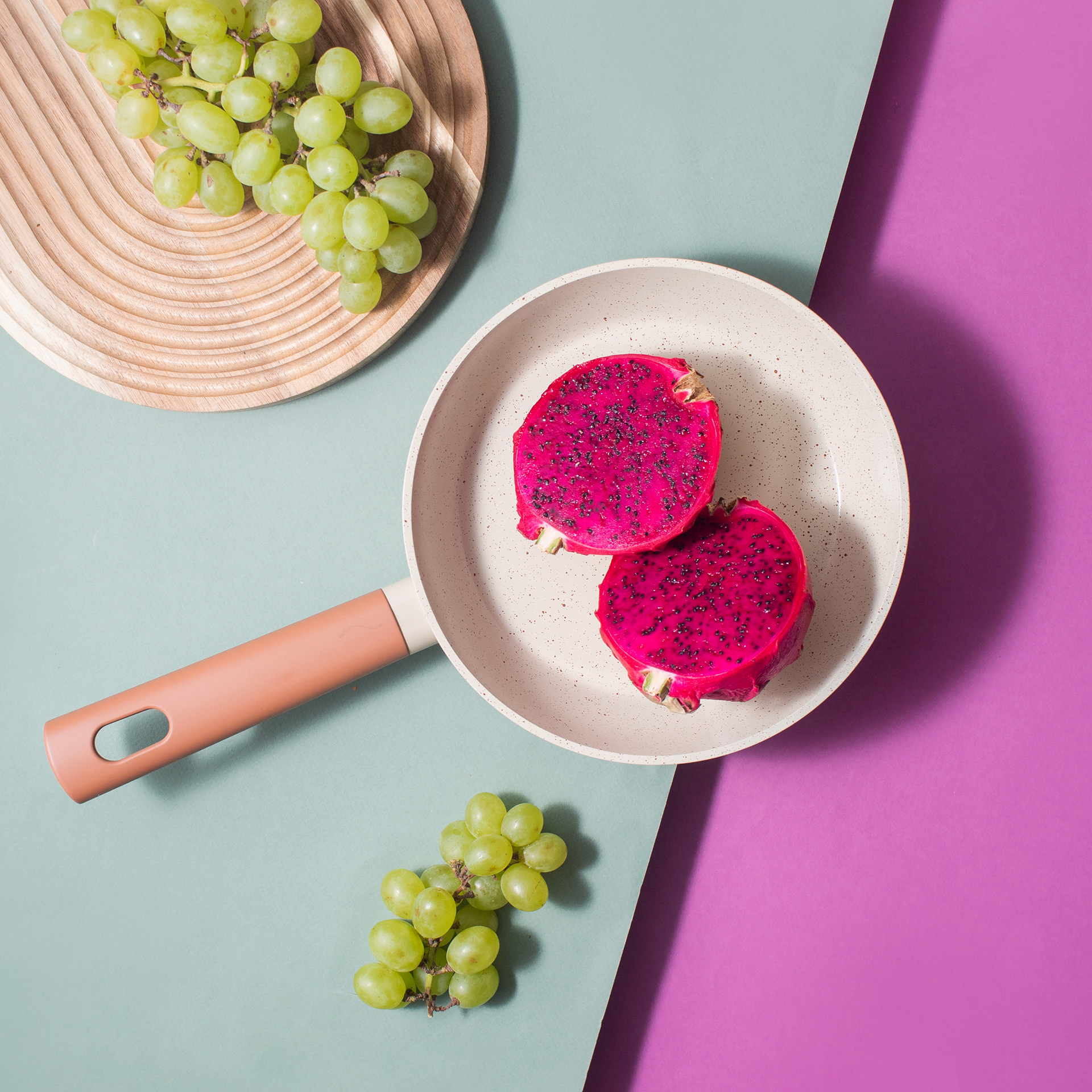
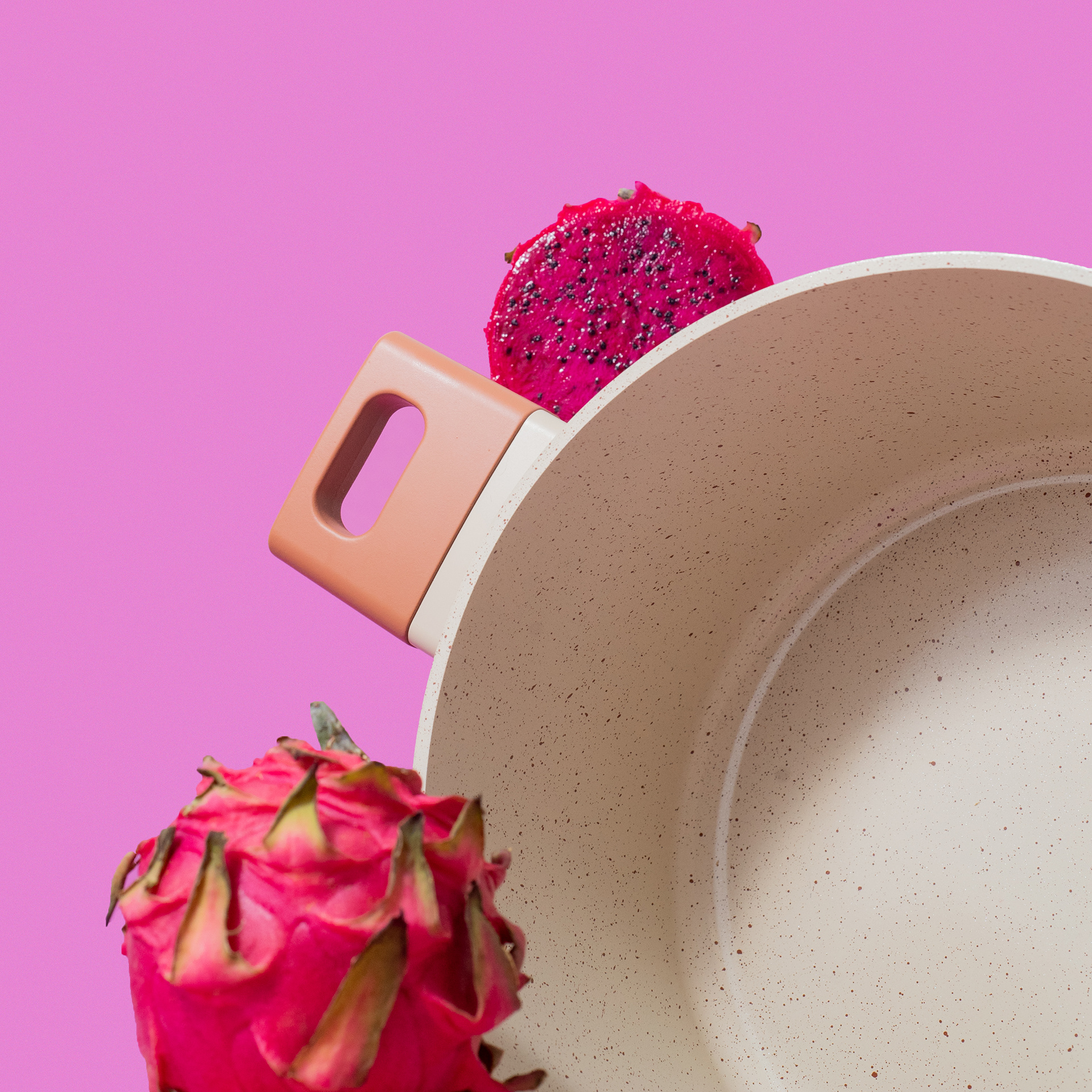
In the second approach, we brought in the ludic and artistic aspect that is so present in Oikos. We took the opportunity to immerse the pans in the visual universe of their “flavors,” reinforcing the identity of each line.
--
[PT]
Na segunda abordagem, trouxemos o aspecto lúdico e artístico presente na Oikos. Aproveitamos para imergir as panelas, de forma visual, no universo dos seus “sabores”, reforçando a identidade de cada linha.
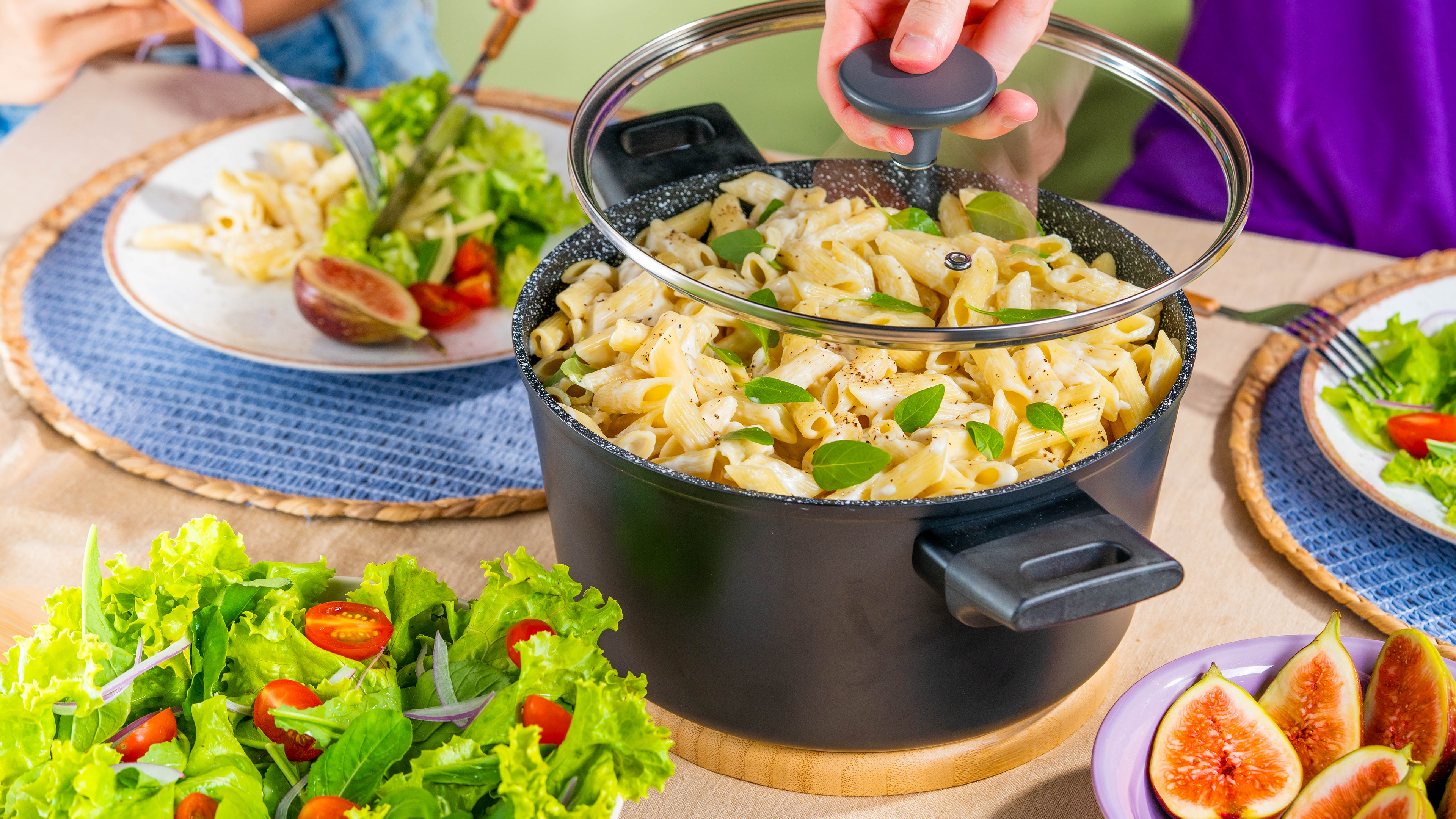
[EN]
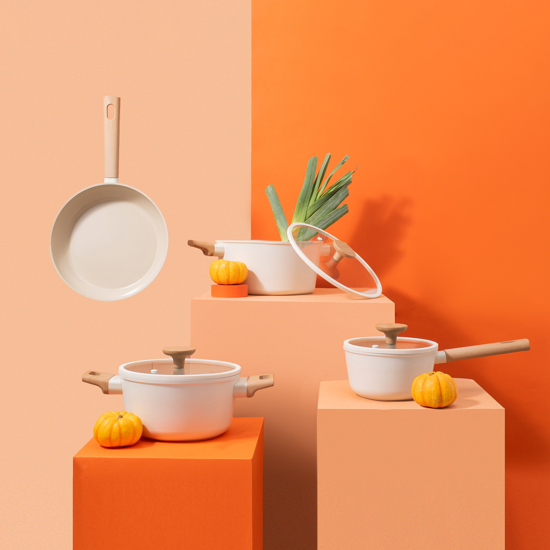
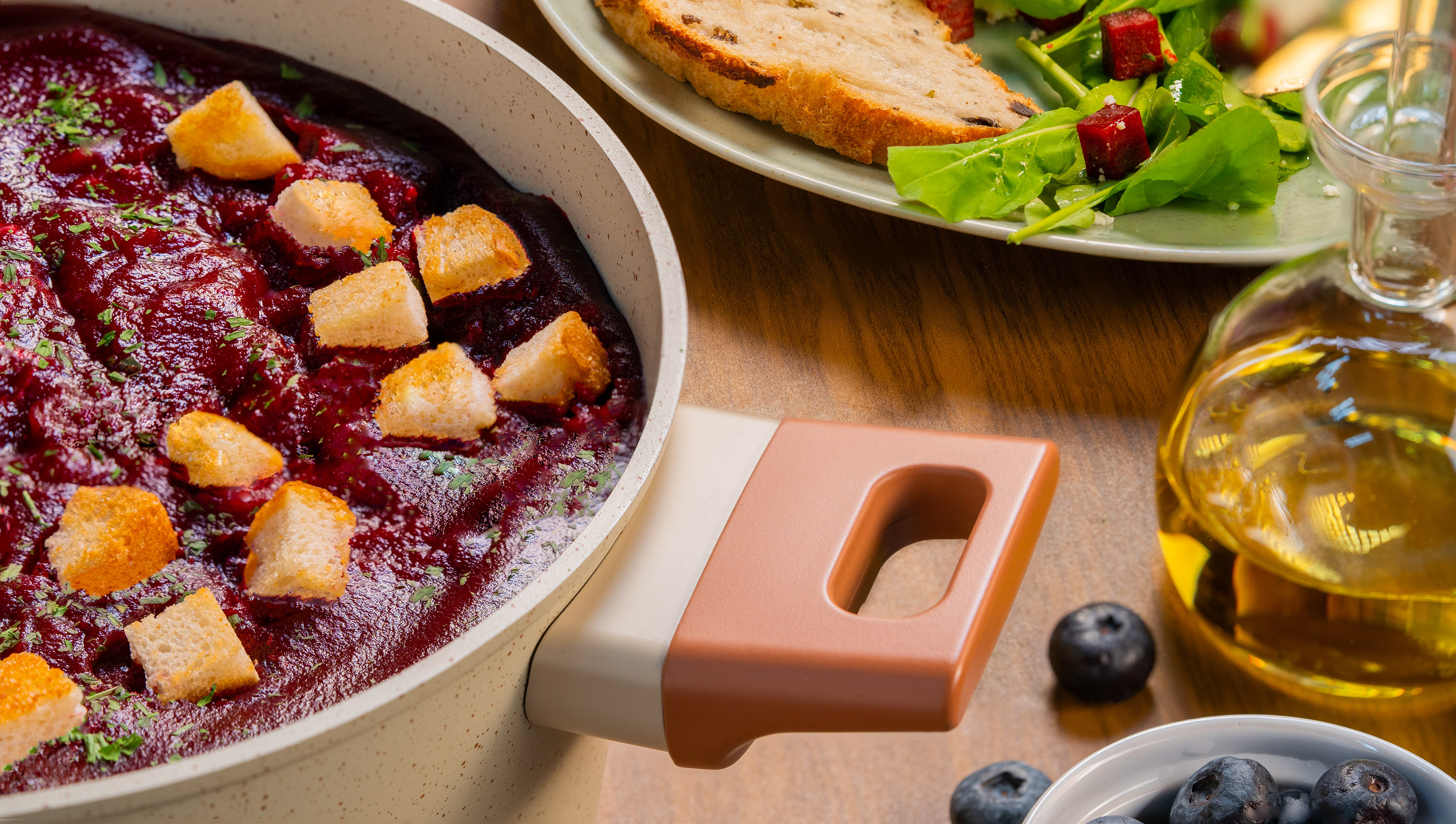
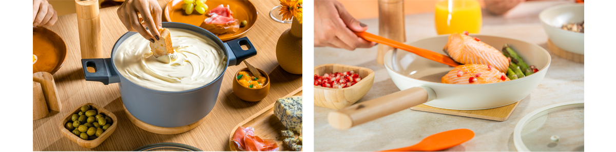
The third approach was more commercial, focused on marketplaces and e-commerce platforms where Mou would be sold. We placed the pans in four different conventional situations, such as a family dinner or an outdoor lunch with friends, each with its own particular mood. This highlighted one of the line’s key assets: its distinctive design and beauty, making the pans something to proudly display on the table.
--
[PT]
A terceira abordagem foi mais comercial, pensada para os marketplaces e e-commerces onde a Mou seria vendida. Colocamos as panelas em situações mais convencionais, como um jantar em família ou um almoço com amigos no jardim, cada cena trazendo um mood específico. Essa abordagem destacava outro aspecto relevante: o design diferenciado e a beleza da linha, tornando as panelas algo para se exibir com orgulho à mesa.
[EN]
As a complement to the hero video, we created a short video for each line, bringing in the entire visual identity universe and the mood of each “flavor.”
--
[PT]
Como complemento ao vídeo principal, criamos pílulas para cada linha, trazendo todo o universo visual e o mood de cada “sabor”.
As a complement to the hero video, we created a short video for each line, bringing in the entire visual identity universe and the mood of each “flavor.”
--
[PT]
Como complemento ao vídeo principal, criamos pílulas para cada linha, trazendo todo o universo visual e o mood de cada “sabor”.